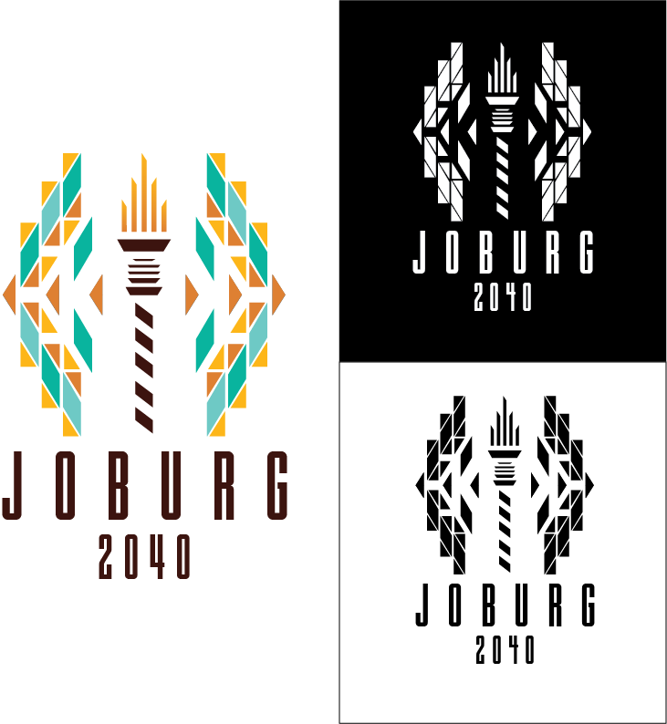
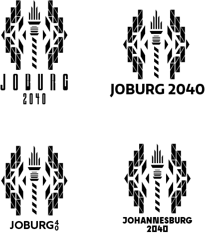
For this Olympic bid logo, the city I represented
was Johannesburg, South Africa. The middle shape is
a combination of the Sentech building in Joburg and
the Olympic torch. The patterns are based off of street
art in Joburg with extreme symmetry. Since this is a
summer logo, I added bright teals and oranges to
represent the brightness of summer. The typography
is reflecting the tallness of the rectangular shapes in
the logo.
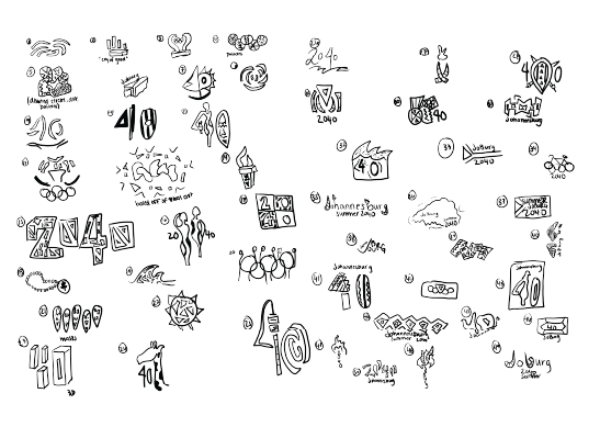
Sketches
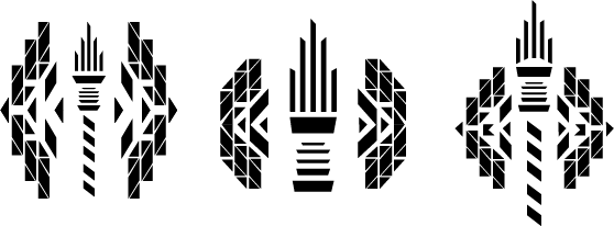
Black and white first logo trials
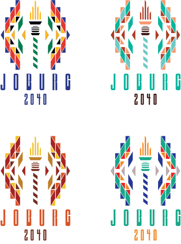
Typography and color trials
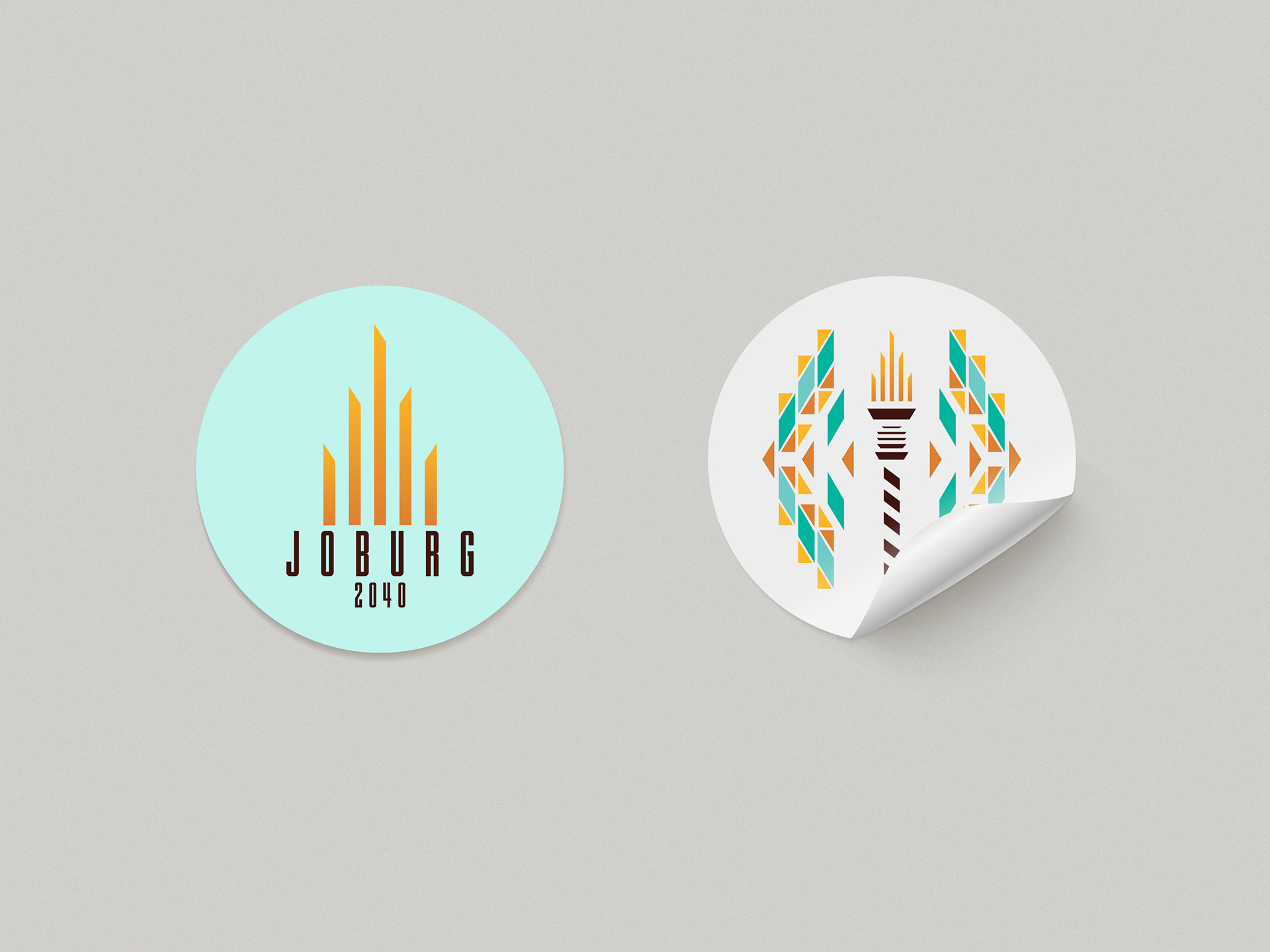
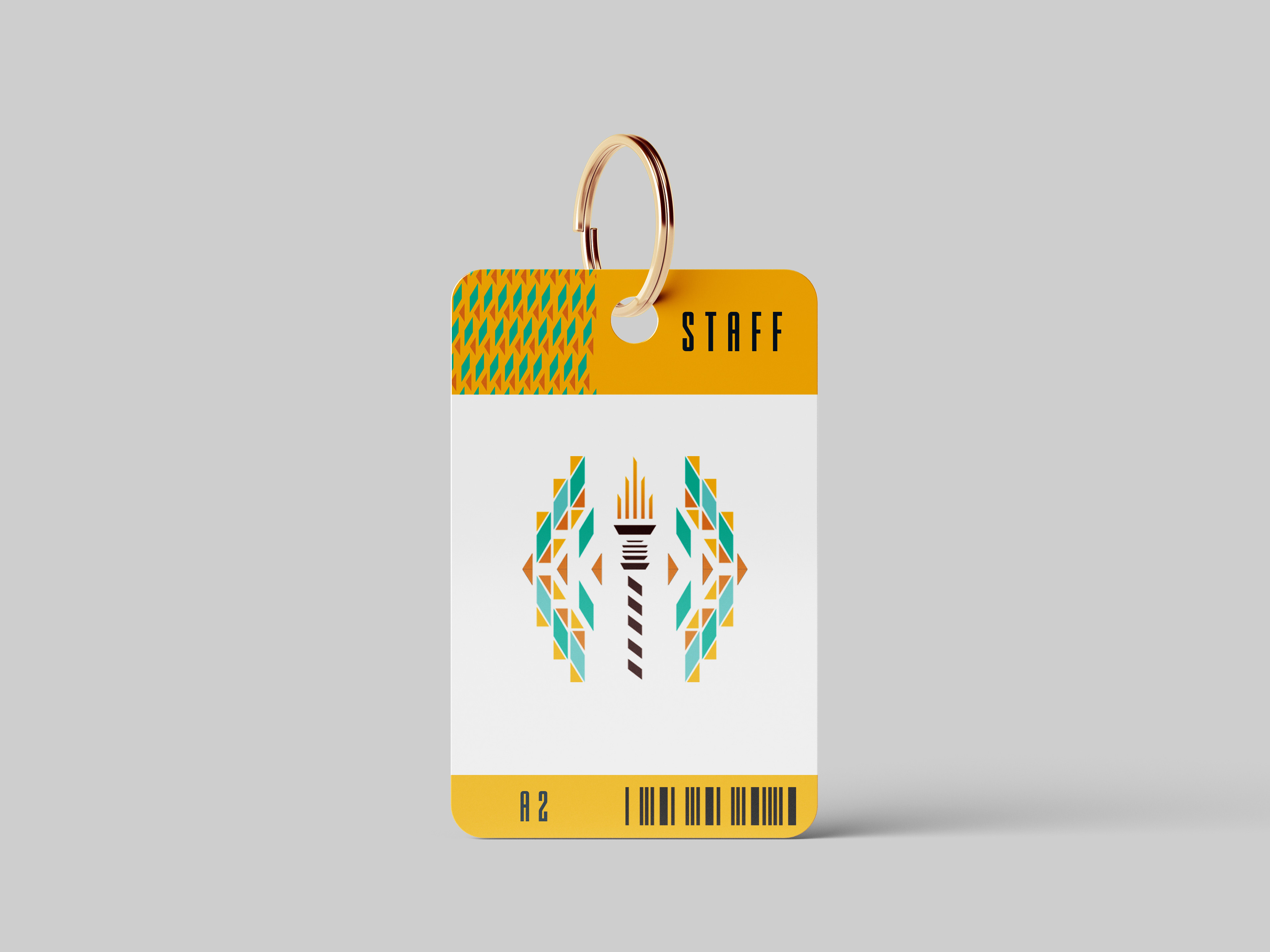
Mockups